


Your cart is currently empty.
Two marble chandeliers can share a similar shape and still create completely different moods. The difference often comes from the stone itself: its color, veining, contrast, translucency, and the way the pattern moves across the fixture.
This is one reason marble lighting can feel more expressive than many conventional fixtures. The silhouette provides the structure, but the stone pattern gives the chandelier much of its personality.
White marble can make a room feel light and architectural. Green marble introduces richer natural color. Blue marble can feel cooler and more artistic, while amber-toned stone brings warmth and depth.
Even within the same color family, the character can change dramatically depending on whether the veining is subtle, cloudy, striped, high-contrast, or strongly directional.
When choosing marble lighting, it is easy to focus first on the overall color. But color is only one part of what determines how the fixture will look in a room.
Veining creates movement. Contrast determines how graphic the stone appears. Pattern density affects whether the chandelier feels quiet or dramatic. The direction of the veining can even influence how we perceive the shape of the fixture.
A pale marble with soft, low-contrast veining often feels calm and understated. The same chandelier silhouette made with stronger, darker veining may become a much more dominant statement.
This becomes particularly noticeable when marble is repeated across several panels, discs, or tiers. Each individual piece contributes to a larger visual rhythm.
High-contrast marble patterns immediately attract attention because the darker markings remain visible even from across the room.
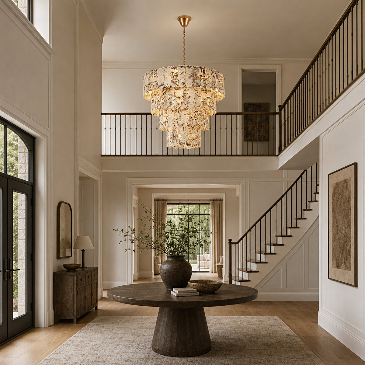
On a chandelier with multiple tiers or repeated stone elements, that contrast creates additional movement. The fixture no longer reads as one simple block of color. Instead, individual sections show subtle differences, creating a more layered appearance.
This kind of marble works particularly well in interiors where the chandelier is intended to become the central decorative feature.
If the furniture, walls, and rugs are relatively neutral, stronger marble patterning can provide the visual complexity the room needs without introducing many additional accessories.
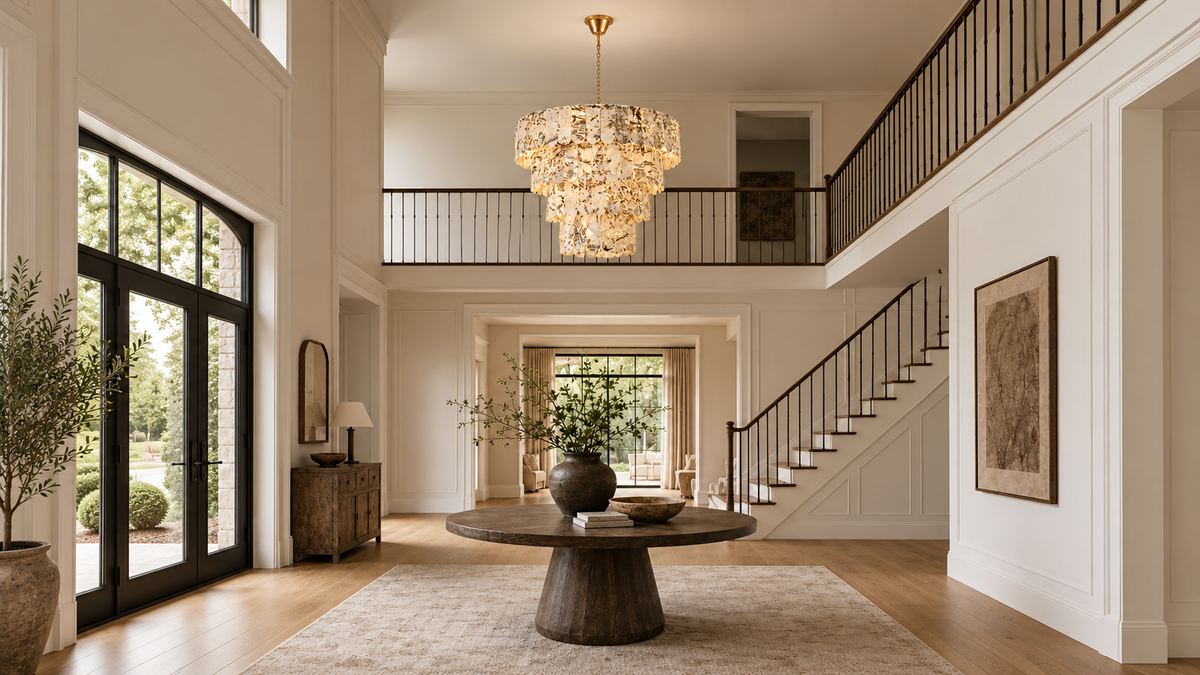
The combination of a tiered silhouette and highly visible stone pattern gives this design a stronger sculptural quality. It is particularly suited to spaces where the chandelier needs enough presence to anchor a larger room.
Explore Snowflake Marble Chandelier →Green marble has a very different personality from white stone. Instead of disappearing quietly into a neutral interior, it introduces visible color while still feeling connected to natural materials.
Depending on the specific pattern, green stone can include darker veins, lighter mineral-like markings, and significant variation between sections.
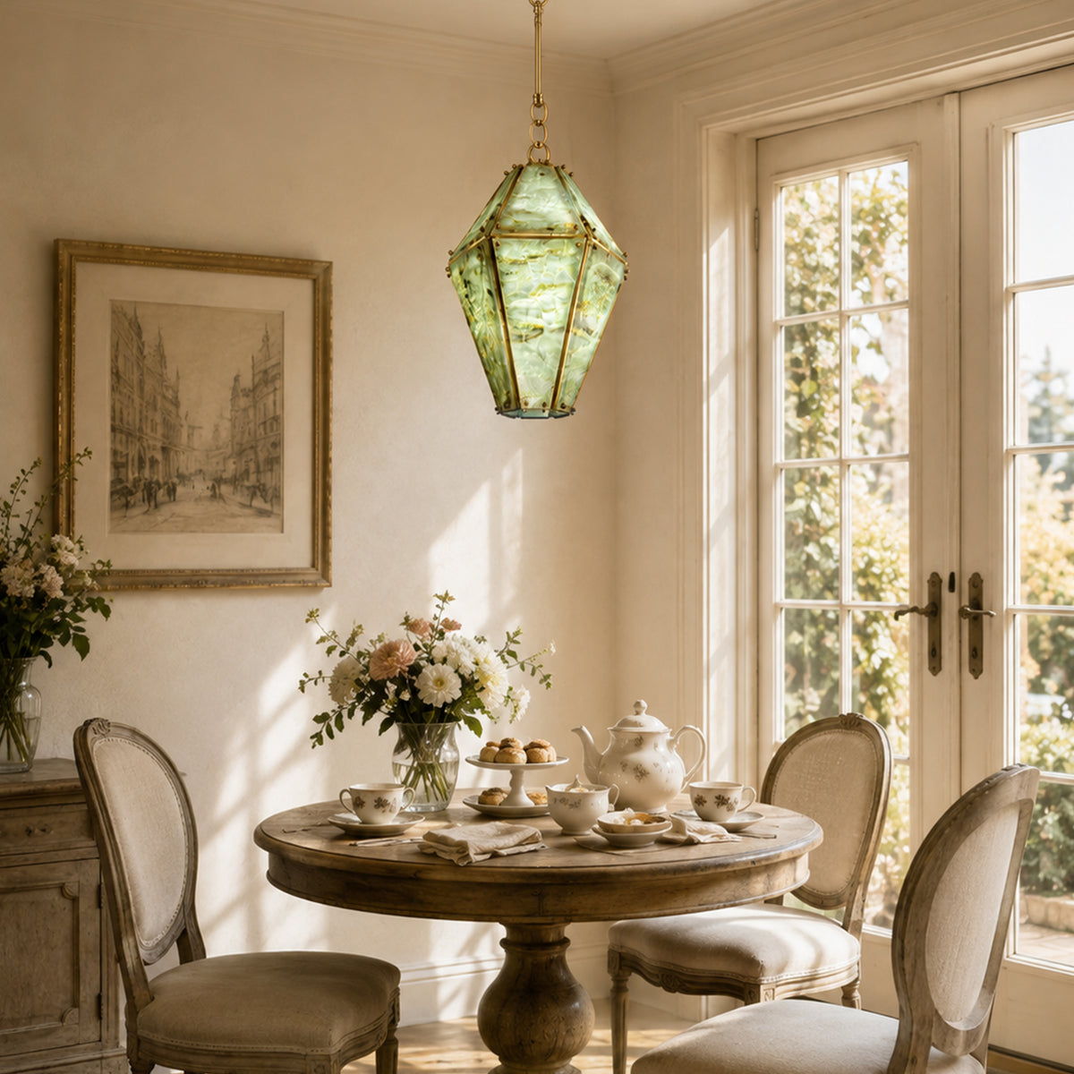
This makes it particularly effective in interiors built around walnut, brass, cream upholstery, earthy neutrals, and darker wood finishes.
Because the color itself already has strong visual presence, green marble lighting often works best when the surrounding room gives it enough breathing space.
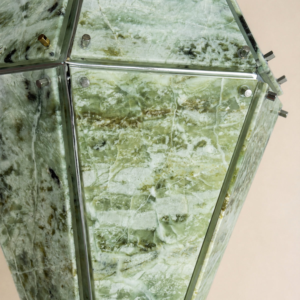
Looking at the stone more closely reveals why green marble can feel so expressive. The surface is not one uniform green tone. Lighter and darker areas move through the material, creating natural variation.
In a smaller fixture, these markings function almost like artwork. Instead of relying on complicated metal ornament or decorative crystals, the stone itself becomes the detail.
The faceted lantern form gives the green marble defined architectural edges, while the irregular stone markings prevent the geometry from feeling too rigid.
Explore Green Marble Chandelier →White marble lighting is often the easiest to integrate into modern interiors because the base color remains relatively neutral.
Rather than introducing strong color, the interest comes from subtle veining, shifts between translucent and opaque areas, and the way the surface responds to light.
This makes white marble especially effective in interiors influenced by quiet luxury, organic modern design, and contemporary minimalism.
It pairs naturally with pale oak, warm white walls, cream upholstery, light stone, brass, black metal, and soft beige palettes.
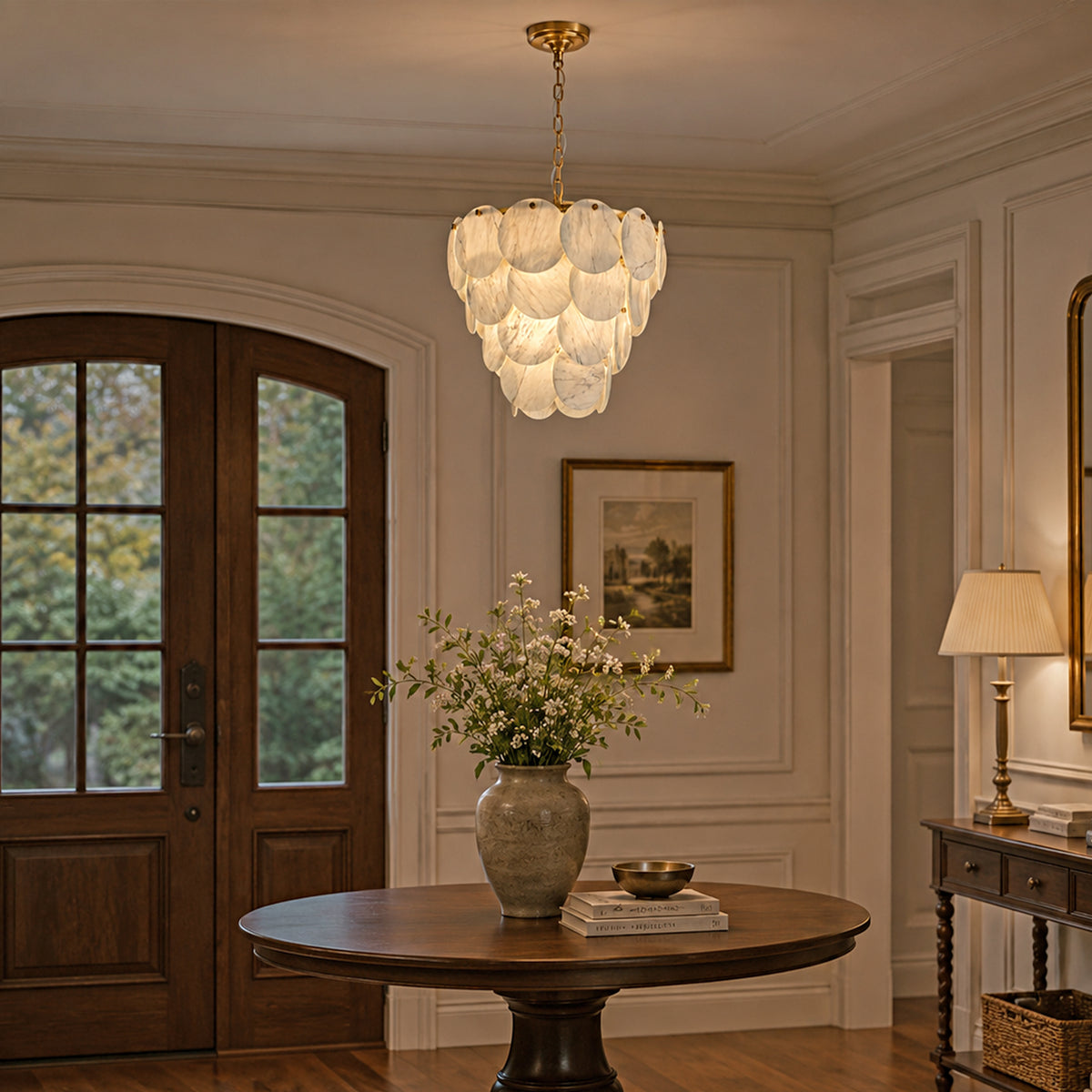
White stone does not need dramatic markings to feel interesting. In many interiors, softer veining is actually an advantage because it allows the fixture to add material richness without competing with the furniture.
From farther away, the chandelier or pendant may read as a clean sculptural form. At closer range, the stone pattern provides additional detail.
This combination makes white marble particularly useful when the room already includes expressive furniture, patterned stone surfaces, artwork, or architectural features.
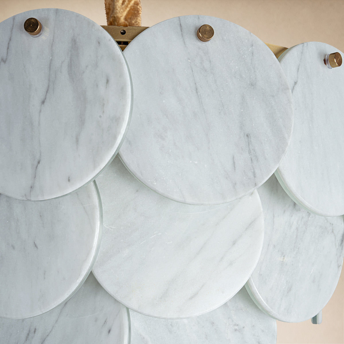
The simple circular form keeps attention on the material itself. The result is a light that can feel sculptural without becoming overly decorative.
Explore White Marble Pendant →Blue marble creates one of the strongest departures from conventional neutral stone lighting.
Cooler color introduces a more distinctive visual identity, while natural pattern keeps the material from feeling flat or synthetic.
Blue stone can work particularly well in contemporary interiors, modern kitchens, bedrooms, and smaller areas where a compact pendant is intended to act almost like a decorative object.
It can be paired with white, charcoal, pale wood, cool gray, black metal, or warmer finishes when the room needs additional contrast.
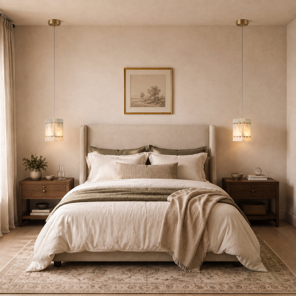
A close view shows that the blue appearance is made up of tonal variation rather than one flat color.
Areas of darker and lighter stone give the fixture depth and allow each side to look slightly different depending on the angle.
On a compact geometric pendant, that variation creates an effective contrast: the shape remains simple, but the surface is visually complex.
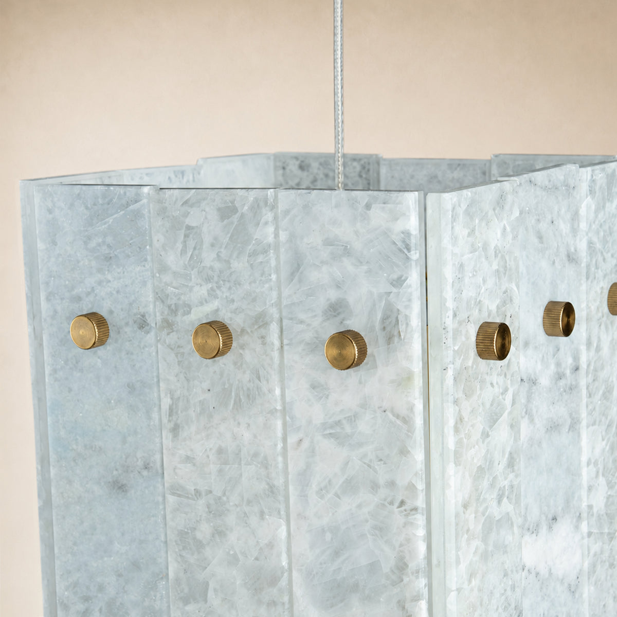
The compact box silhouette creates clean geometry, allowing the blue stone pattern to become the main decorative feature rather than relying on additional ornament.
Explore Blue Stone Pendant →Amber marble moves the palette in the opposite direction from blue stone. Instead of creating a cooler statement, it introduces warm brown, honey, amber, and earth-toned character.
This can make the fixture feel especially inviting in dining areas, living rooms, entryways, and interiors that rely heavily on wood or warm neutral materials.
The panel format can also emphasize variation across the stone. Individual sections may show different concentrations of color and veining, which prevents a larger chandelier from looking repetitive.
Amber marble works particularly well with walnut, dark oak, bronze, brass, cream walls, beige upholstery, and other warm finishes.
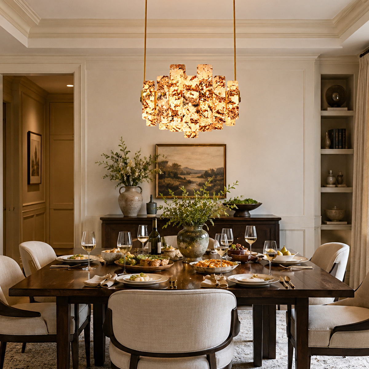
The amber surface combines stronger warm coloration with irregular natural movement. Instead of reading as a uniform brown fixture, the stone shows different levels of depth across the panels.
This makes it a good option for spaces where lighting should contribute warmth even before the fixture is turned on.
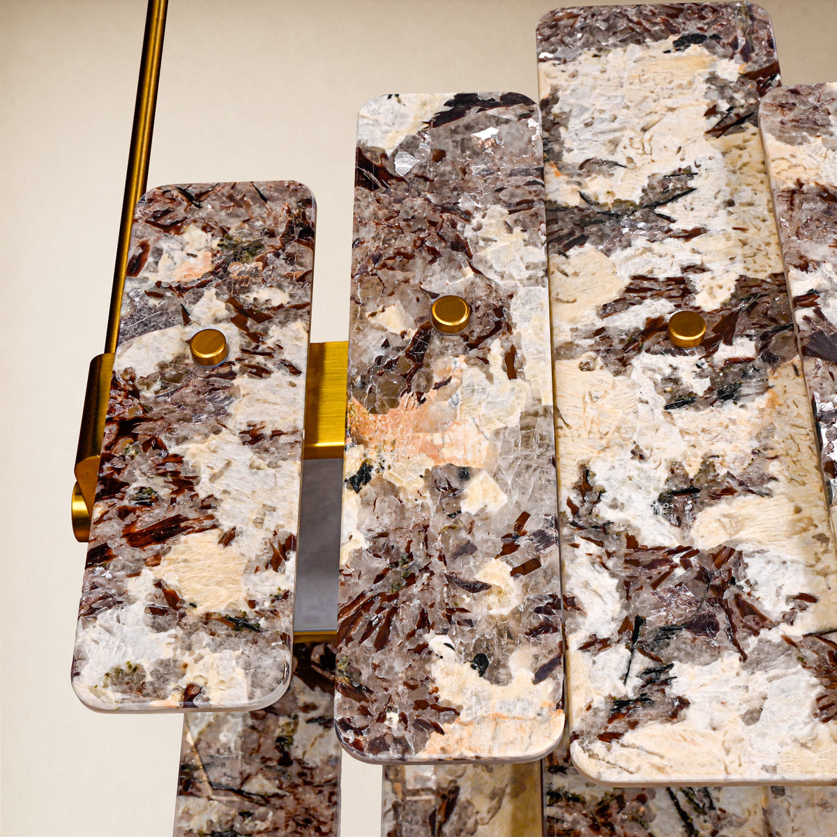
The warm stone panels give this chandelier a distinctly different character from white, green, or blue marble lighting, making it especially useful for interiors built around richer earth tones.
Explore Amber Marble Chandelier →The same marble can look different depending on how the stone is cut and arranged within the fixture.
The right choice depends on whether you want the lighting to quietly support the room or become one of its most noticeable design elements.
Yes. Pattern affects how quiet, dramatic, warm, cool, or graphic the fixture feels. It can significantly change the visual impact even when the chandelier shape stays similar.
White marble is generally the most versatile because it works easily with light and dark woods, neutral fabrics, brass, black metal, and many stone surfaces.
Not necessarily. Green marble works especially well with walnut, brass, cream, beige, warm neutrals, and darker natural materials.
Yes. Blue can create intentional contrast against warm wood, brass, beige, or cream. The result often feels more contemporary and layered.
Amber marble naturally complements walnut, dark oak, brass, bronze, cream upholstery, beige walls, and other warm earth-toned materials.
Exact matching is not necessary. Coordinating undertones and controlling the amount of visual pattern usually creates a more sophisticated result.
Marble lighting becomes more interesting when it is chosen for both shape and material character. White, green, blue, amber, and high-contrast stone each bring a different visual language into the home.
By considering color, veining, contrast, fixture shape, and the materials already present in the room, it becomes much easier to choose a marble chandelier that feels intentional rather than simply decorative.
Explore Pietra Marble Lighting →
How Marble Patterns Change the Look of a Chandelier
Discover how white, green, blue, amber, and high-contrast marble patterns change the mood of a chandelier, with styling tips for choosing the right stone lighting for modern interiors.
Read moreabout How Marble Patterns Change the Look of a Chandelier
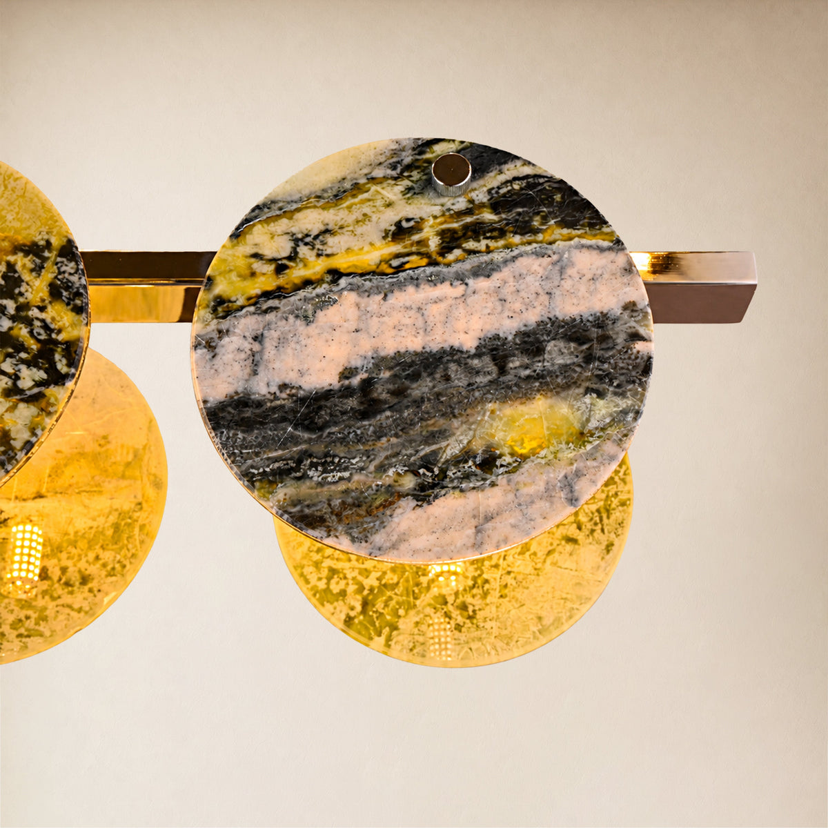
How to Choose a Linear Marble Chandelier for a Kitchen Island or Dining Table
Learn how to choose a linear marble chandelier for a kitchen island or dining table, including sizing, hanging height, stone color, open-concept styling, and modern lighting ideas.
Read moreabout How to Choose a Linear Marble Chandelier for a Kitchen Island or Dining Table
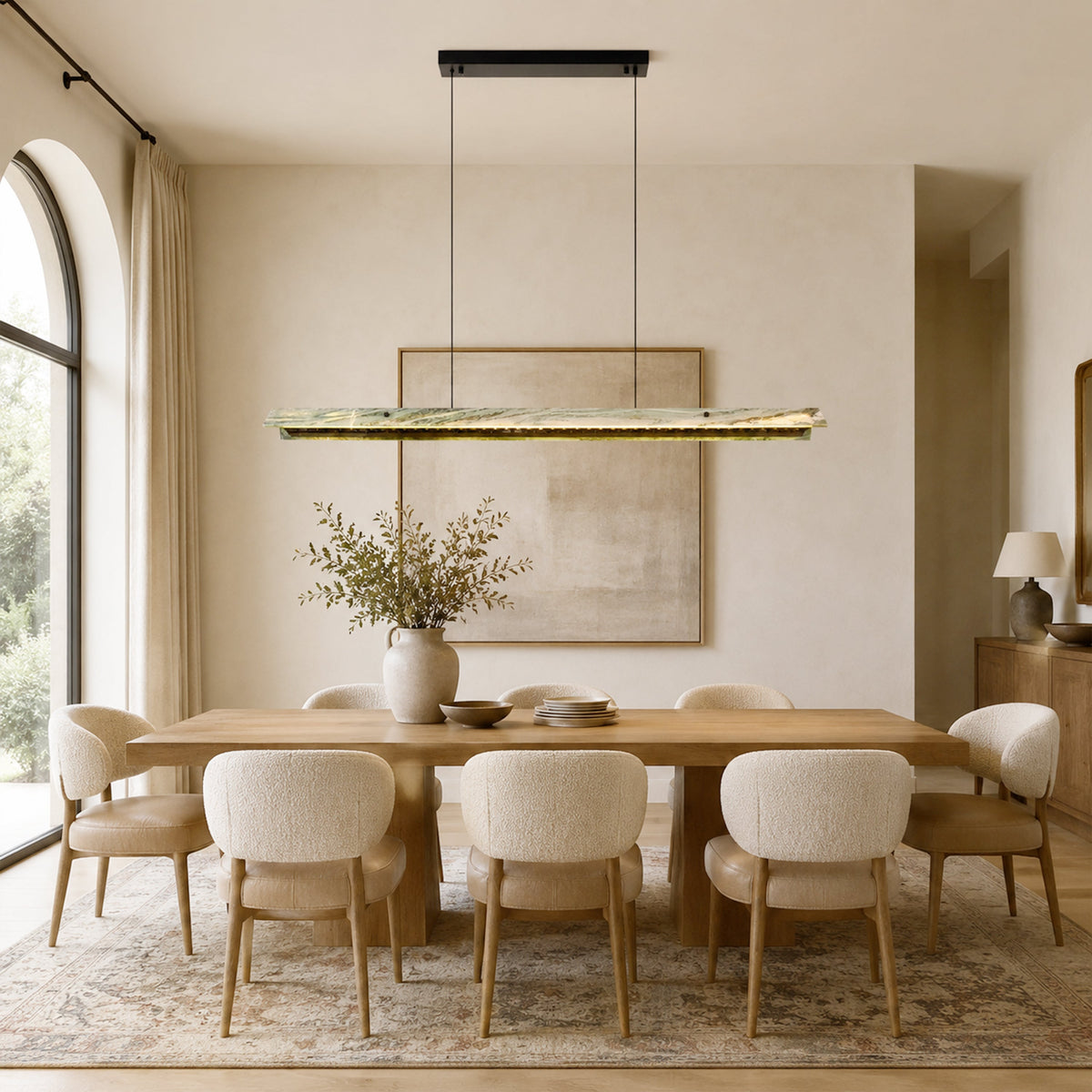
How to Choose a Marble Chandelier for Your Dining Room
Learn how to choose the right marble chandelier for your dining room, including round vs. linear designs, scale, ceiling height, stone pattern, and styling ideas for modern interiors.
Read moreabout How to Choose a Marble Chandelier for Your Dining Room
Share:
How to Choose a Linear Marble Chandelier for a Kitchen Island or Dining Table